由Flux AI Image Generator创建的AI图像
提示
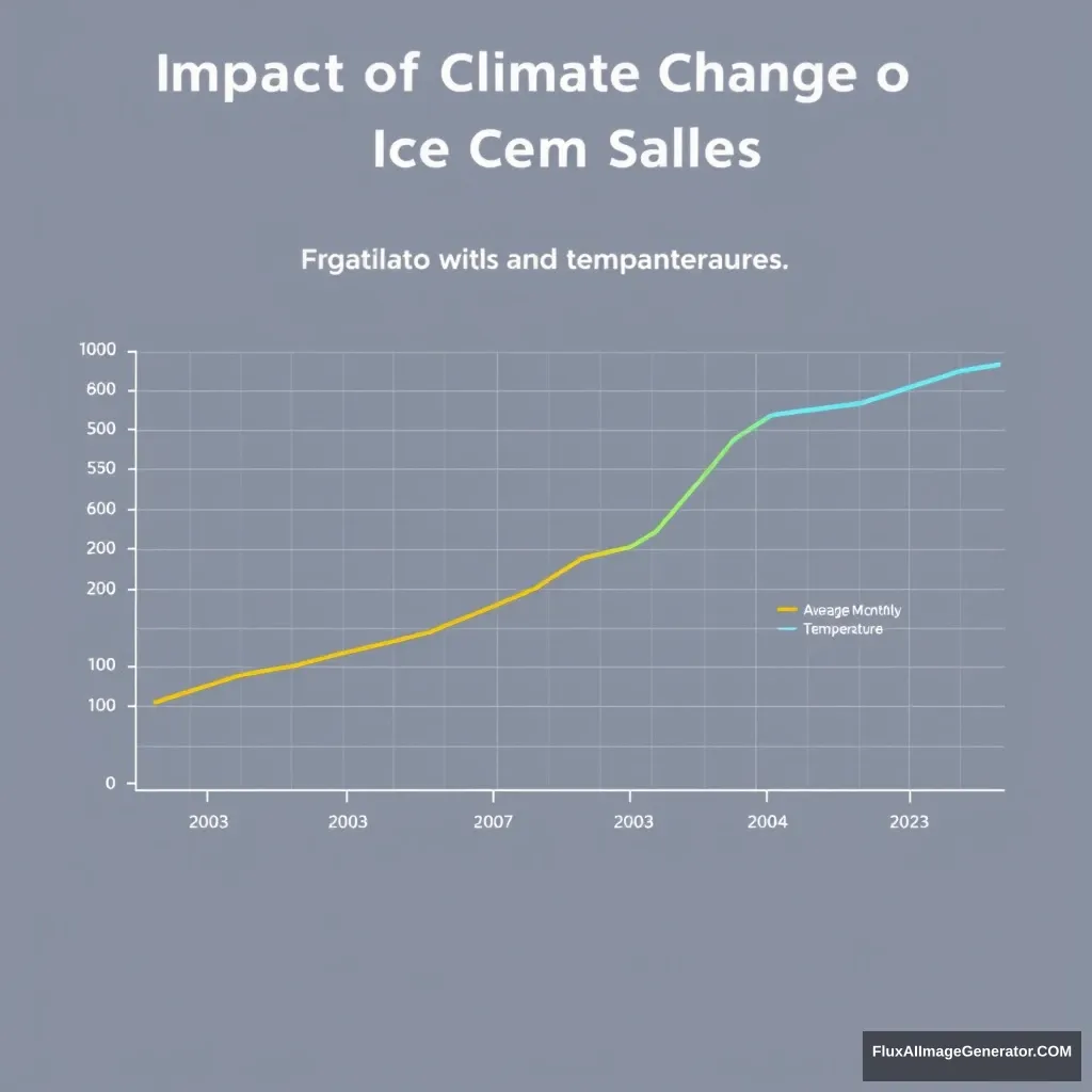
"Generate a detailed line graph illustrating the relationship between average monthly ice cream sales and average monthly temperatures over the past 20 years. Include the following elements: 1. Title: ‘Impact of Climate Change on Ice Cream Sales’ 2. X-axis: ‘Year’ with labels for each year from 2003 to 2023. 3. Y-axis on the left: ‘Average Monthly Ice Cream Sales (in units)’ with appropriate scale. 4. Y-axis on the right: ‘Average Monthly Temperature (°C)’ with appropriate scale. 5. Two data series: one line for ice cream sales and another for temperature. 6. Legend identifying the two data series. 7. Clear, distinguishable colors for each data series. 8. Gridlines for better readability. 9. Annotation for significant events (e.g., heatwaves, major climate agreements) that may have impacted sales or temperature."
图像分析
情感分析
应用场景
Annual Climate Conference Presentation
描述: Climate Studies Presentation
潜在用途: The graph can be used in presentations at climate conferences to illustrate the correlation between temperature changes and ice cream sales.
Ice Cream Industry Market Analysis
描述: Market Research Analysis
潜在用途: Businesses in the ice cream industry can use this graph for market analysis and to make informed decisions about product launches in warmer months.
Teaching Climate Change Effects
描述: Educational Purposes
潜在用途: Educators can utilize this graph to explain the impacts of climate change on consumer behavior in economics or environmental science classes.
Seasonal Marketing Strategy Planning
描述: Advertising Strategy Development
潜在用途: Marketing teams can leverage this data to plan targeted advertising campaigns based on expected temperature trends.
技术分析
质量评估: The graph effectively communicates the intended relationship and is visually engaging.
- Clear title and labeling enhance understanding.
- Effective use of color distinguishes data series.
- Gridlines improve readability and analysis.
- Add more detailed annotations for context
- Include more diverse data points for accuracy
- Provide interactive elements for user engagement