Flux AI Image Generatorによって作成されたAI画像
プロンプト
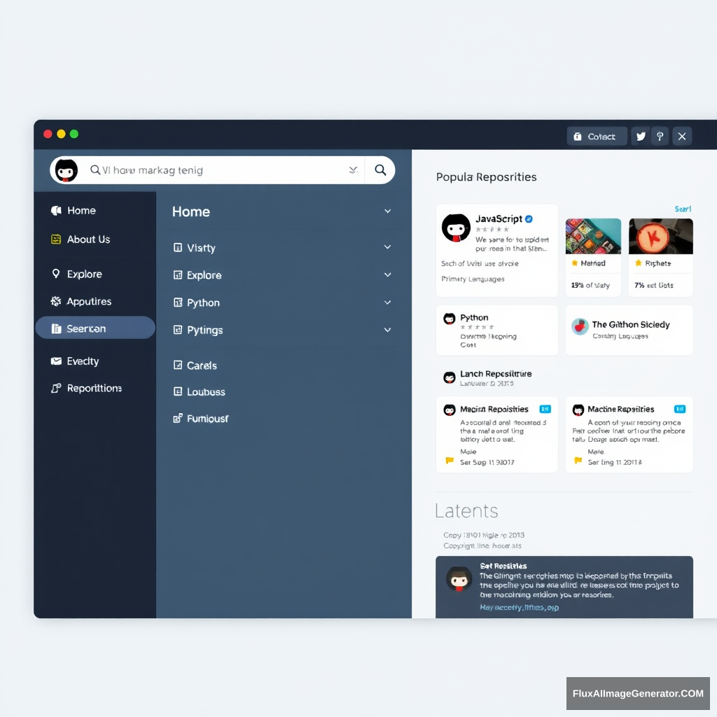
A sleek GitHub navigation website interface. The fixed top navigation bar occupies 10% of the screen height, spanning 100% width, with a logo and links like "Home", "Explore", and "About Us". Below, an 8% height search bar, centered and 80% width, featuring a magnifying glass icon. On the left, a sidebar with clickable tags such as "JavaScript", "Python", and "Machine Learning", taking up 20% width and 60% height. To the right, popular repository cards fill 75% width and 40% height, displaying names, descriptions, star counts, and primary languages. Below, a "Latest Repositories" block, 75% width and 20% height, shows recent projects with summaries and timestamps. The footer, 10% height and 100% width, includes copyright info, social media links, and contact details. The design is modern and minimalistic, featuring a palette of cool blues and neutral grays, accented with soft white backgrounds and a clean sans-serif font, ensuring a responsive and user-friendly layout.
画像分析
感情分析
アプリケーションシナリオ
Developer Portfolio
説明: Designing a portfolio website for a developer to showcase their projects.
潜在的な用途: This interface helps developers present their work and attracts potential employers or clients.
Open-source Community Hub
説明: Creating a community platform for open-source projects.
潜在的な用途: The layout encourages collaboration and discovery of projects within the community.
Programming Language Tutorials
説明: Building a tutorial resource for programming languages.
潜在的な用途: The sidebar can categorize tutorials by language, making it easy for users to find relevant resources.
Tech News Aggregator
説明: Developing a tech news aggregator site.
潜在的な用途: The interface can display recent articles or repositories trending in the tech community.
Coding Challenge Platform
説明: Implementing a coding challenge platform.
潜在的な用途: The popular repository cards could showcase different coding challenges and their results.
技術分析
品質評価: High-quality design with a clear layout and modern aesthetic that enhances user experience.
- Responsive design ensuring a good experience on various devices
- Clear visual hierarchy directing user attention effectively
- Minimalistic approach that reduces clutter and promotes usability
- Accessibility features for the visually impaired
- Enhanced interactivity for better user engagement
- Optimization for mobile view
- Incorporation of user feedback systems