Hình Ảnh AI Được Tạo Bởi Flux AI Image Generator
Lời Nhắc
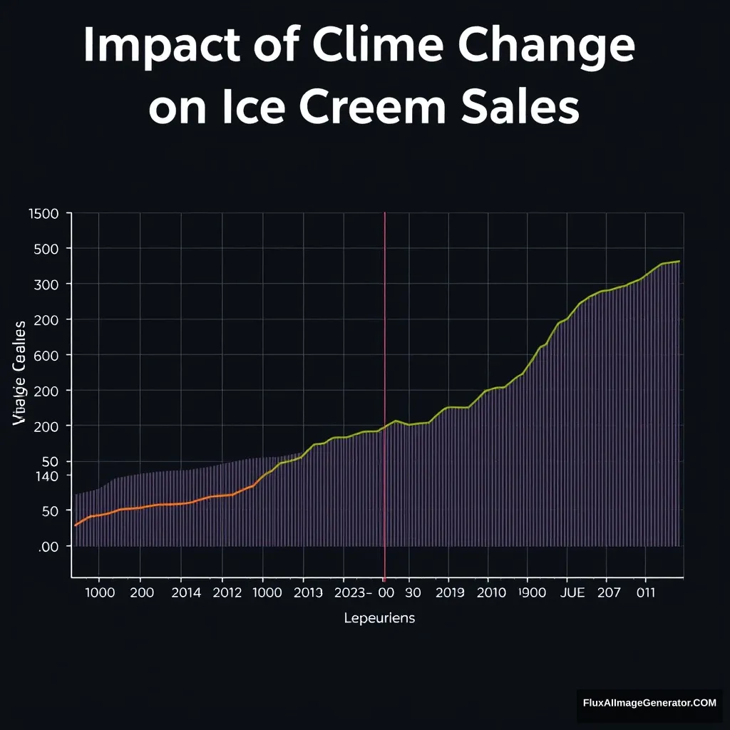
Create a publication-quality graph showing the relationship between ice cream sales and climate change over the past 20 years in Matlab style. The graph should feature: - A line plot with two distinct Y-axes. - The left Y-axis represents average monthly ice cream sales in units. - The right Y-axis represents average monthly temperature in °C. - The X-axis represents the years from 2003 to 2023. - Use clear, distinguishable colors: one color for the ice cream sales line and another for the temperature line. - Include a legend to identify the two data series. - Add gridlines for better readability. - Title the graph ‘Impact of Climate Change on Ice Cream Sales’. - Use a minimalist theme for a clean, professional look. - Ensure high resolution suitable for academic publication.
Phân Tích Hình Ảnh
Phân Tích Cảm Xúc
Kịch Bản Ứng Dụng
Presenting sales data trends
Mô Tả: Academic Research Presentation
Sử Dụng Tiềm Năng: To analyze the correlation between climate change and consumer behavior in academic settings.
Sales strategy meetings
Mô Tả: Business Analysis and Strategy Discussion
Sử Dụng Tiềm Năng: To inform marketing strategies based on climate-related sales trends.
Policy impact assessments
Mô Tả: Public Policy Reports
Sử Dụng Tiềm Năng: To advocate for environmental policies based on consumer behavior influenced by climate.
Teaching sessions
Mô Tả: Educational Purposes
Sử Dụng Tiềm Năng: To educate students on the relationships between climate variables and market trends.
Market forecasting
Mô Tả: Investment Analysis
Sử Dụng Tiềm Năng: To assist investors in forecasting the performance of companies in the ice cream industry.
Phân Tích Kỹ Thuật
Đánh Giá Chất Lượng: high quality
- Effective use of dual Y-axes
- Clear color differentiation for data series
- Professional minimalist design
- Add annotations for significant events
- Provide source details for data
- Incorporate a regression analysis line